It’s clear that mobile care (a/k/a smart, connected interactions) will be the hot trend in the customer service industry for 2012. Consider the announcements we’ve already seen in the first third of this year from Genesys, NICE, Virtual Hold and Interactive Intelligence. To be fair, Avaya has been talking about this for a few months and Cisco is undoubtedly sharing a mobile-centric customer collaboration vision with analysts at their conference this week in Boston.
For the most part, the visions proposed by the vendors are the same. Virtual queuing, direct connect with agents, session context passed to the call center to inform routing and agent screen-pop, richer interactions passing images and text in both directions all factor into cute vignettes of the future. My favorite video happens to be this one (mostly because I relate very closely to the nebbish protagonist):
Alas, we’re still a number of years away from the broad adoption of these capabilities by even an early majority of large enterprises. I’ve spent the last few months researching this space, talking with dozens of vendors, customers and analysts. I even helped create what has become a really active LinkedIn group called Mobile Customer Experience to explore the subject.
I’m happy to report that most call center leaders with whom I spoke get (and agree with) the vision of smart, connected interactions but, as is often the case, won’t have time, budget or the infrastructure in place to implement the real sexy parts any time soon.
To wit, consider this recent blog post about customer care mobile apps, which claims:
Air Asia seems to be the pin-up for service app implementation, giving customers the ability to ask questions through their smartphone.
Needless to say, I was intrigued. I downloaded the Air Asia mobile app, to see for myself this “quick, convenient way . . . to find information and answers and engage with customer service.” Note: what follows is a curmudgeonly write-up that might make the most, err, observant of industry analysts proud.
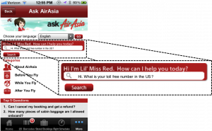
 I love the idea of L’Il Miss Red; anthropomorphism is so much fun. Unfortunately, the implementation feels very reminiscent of some ambitious speech recognition-based virtual agent programs which were ultimately met with mixed reviews.
In this case, both the front and back end leave a lot to be desired. Can’t read the text in the image at left? Neither could I. The input box was so small that I literally had to squint and hold my phone a few inches from my face to see what was going on. It took three tries to tap the right part of the interface to enter my question.
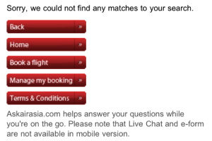
When I submitted my question (a pretty basic one, I thought), the response was simply “Sorry we could not find any matches to your search.” Really? Don’t you even want to try? How about giving me an option to call someone to help me with the question you weren’t able to understand?
Does anyone else see the irony of the fine print at the bottom of the row of buttons presenting options that don’t help me in any way with my inquiry?
It’s all well and good for industry folks to congratulate each other for pushing the envelope but let’s not spend too much energy there. At the end of the day, customers judge us by the utility of the solutions we provide and, if this is really the zenith of current smart, connected interactions, well, we’ve got a long way to go.
Categories: Articles

 Talk to the Web: How NLWeb Opens Conversational Access to Site Content
  Battling ‘Botenfreude’: The Power of People and Policy
  Voice AI Agents Redefine CX: Trends, ROI, and Strategies for 2025
  Why Mylow Signals the Next Phase of AI-Powered Self-Service